
Problems
01
Confusing schedule
Students find the schedule calendar difficult to navigate, with cluttered layouts and unclear event details. This makes it hard for them to understand their daily or weekly commitments, leading to missed classes or important academic events.
02
Inefficient messaging system
Students face challenges when trying to contact professors or university administration, as the current messaging system is cumbersome and lacks clear organization. This delays communication, making it hard for students to get timely responses or assistance with academic issues.
03
Lack of real-time updates
Students often miss last-minute changes in their schedules or important university announcements because the portal doesn’t offer real-time notifications, leaving them unaware of critical updates.
Solutions
01
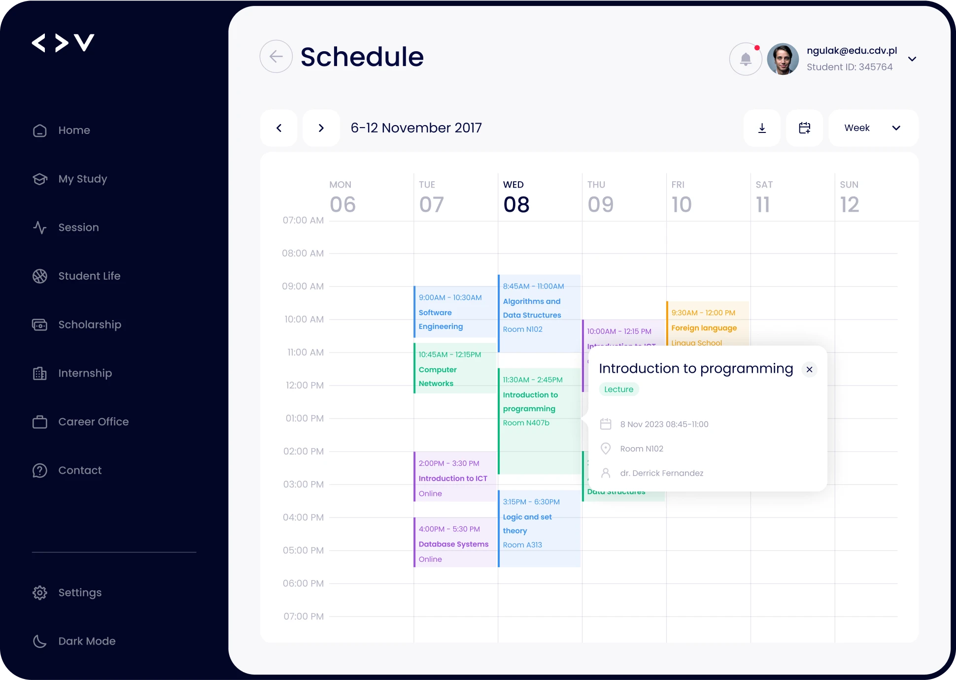
User-friendly calendar
I redesigned the schedule calendar to be more intuitive and visually clear. By using color-coded events and offering both daily and weekly views, I ensured students can easily understand their commitments at a glance. The layout is decluttered, with event details displayed in a simple, accessible format, helping students manage their time and never miss important classes or events.
02
Improved messaging system
I restructured the messaging system to make communication with professors and university administration more efficient. Conversations are now organized by course or topic, allowing students to quickly find past messages and track responses. I also added a clear, easy-to-use interface that encourages faster replies, so students can address academic issues without delays.
03
Real-time notifications
To address missed updates, I integrated real-time notifications for schedule changes and important university announcements. Students now receive instant alerts directly within the portal and on their devices, ensuring they stay informed about any changes or critical information as soon as it’s available.
User stories

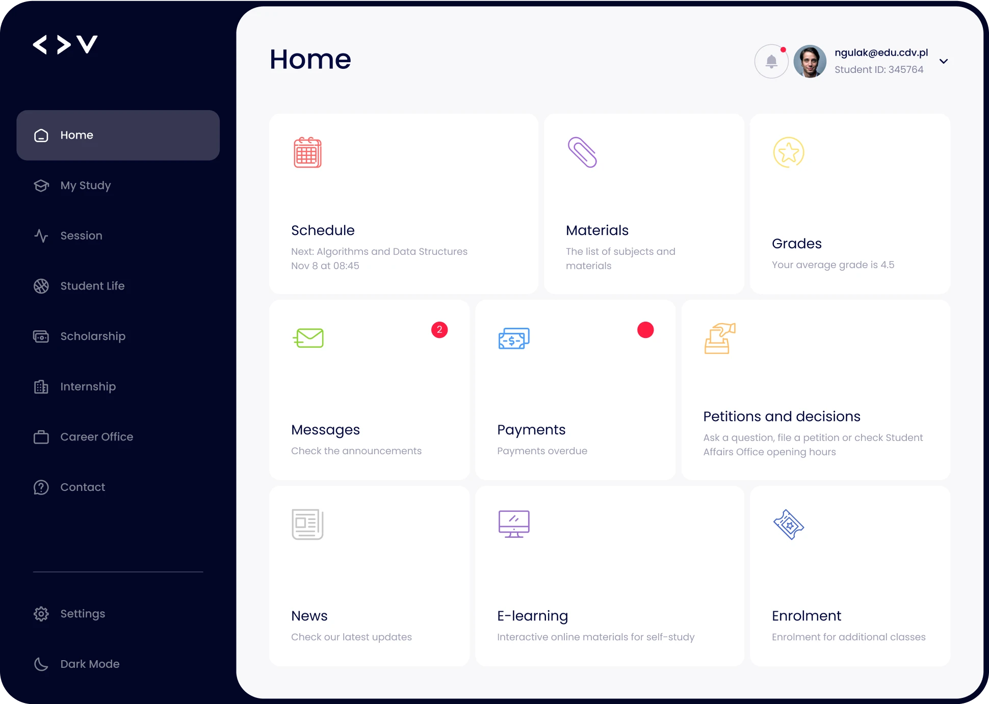
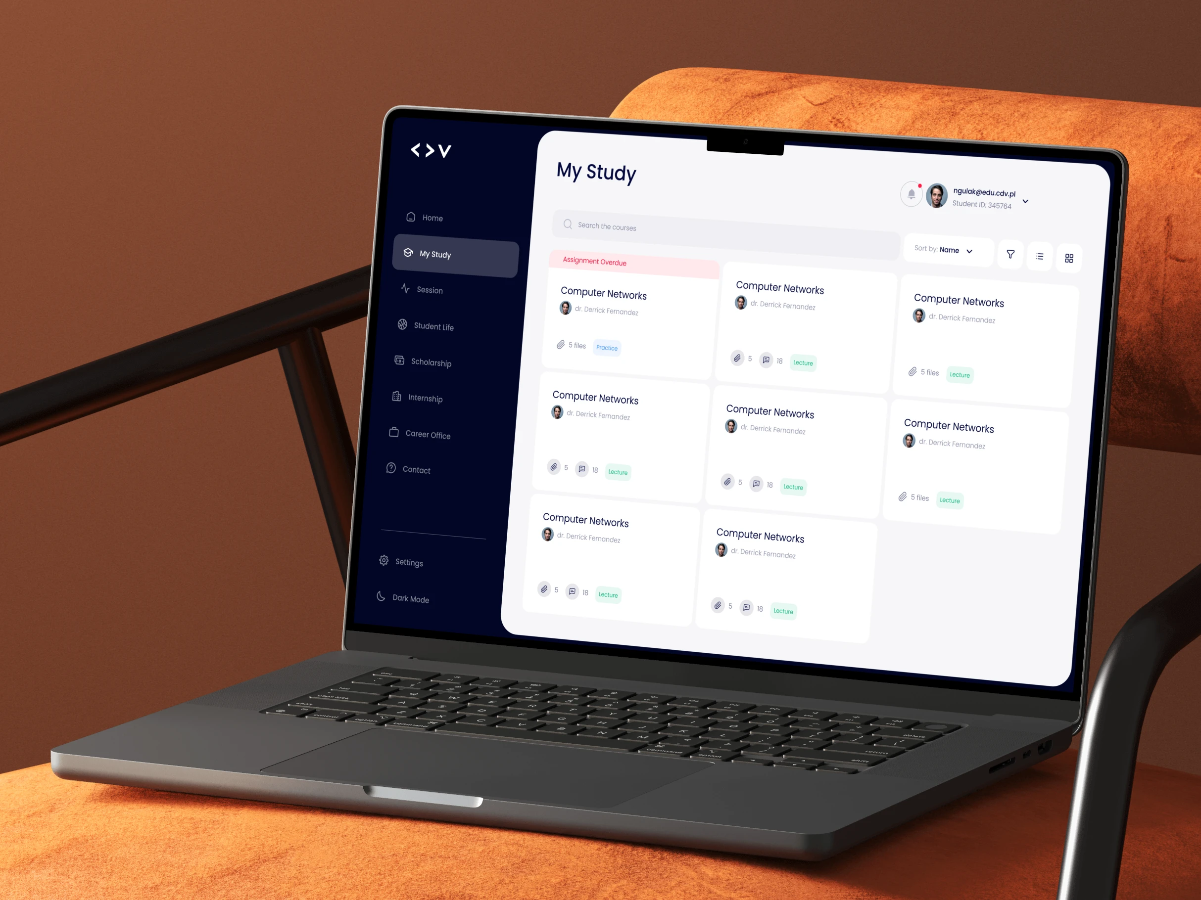
As a student, I want to easily access my class schedule and assignments, so that I can stay organized and manage my time effectively throughout the semester.

As a student, I want to access a centralized hub for campus announcements and news, so that I can stay informed about important updates and events within the university community.

As a professor, I want to efficiently upload and share course materials, so that students can easily access and engage with the necessary resources for their studies.

As a professor, I want to have a user-friendly interface for grading and providing feedback on student submissions, so that I can efficiently assess and communicate with my students.

Poppins
Cetacean Blue
#04093E
Brilliant Azure
#3D92F3
Off White
#FFFFFF
Anti-Flash White
#EFEFF3
Wireframes
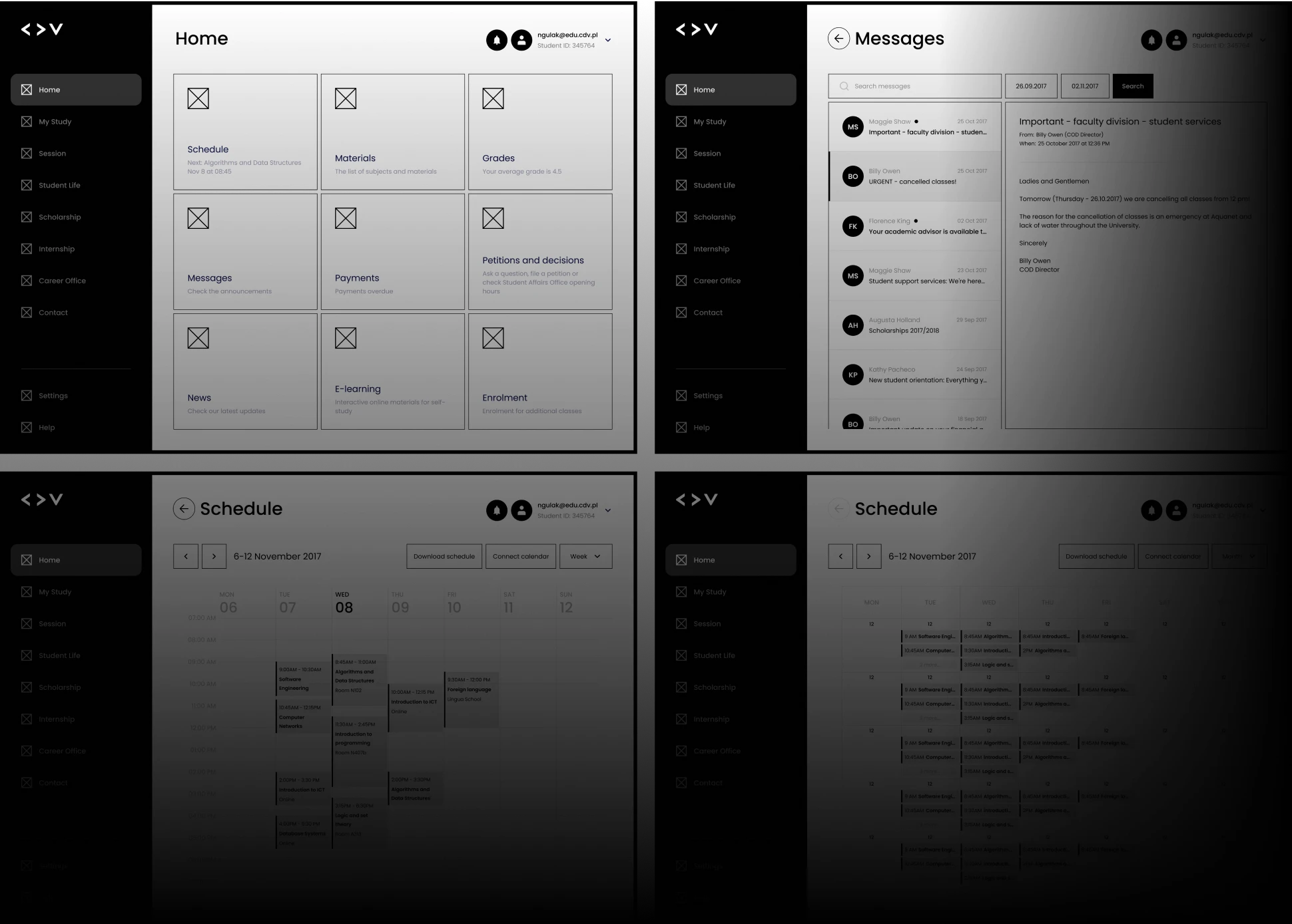
The wireframes were created using a combination of user research and feedback from stakeholders. They found them to be clear, easy-to-understand, and helpful.

Dark mode
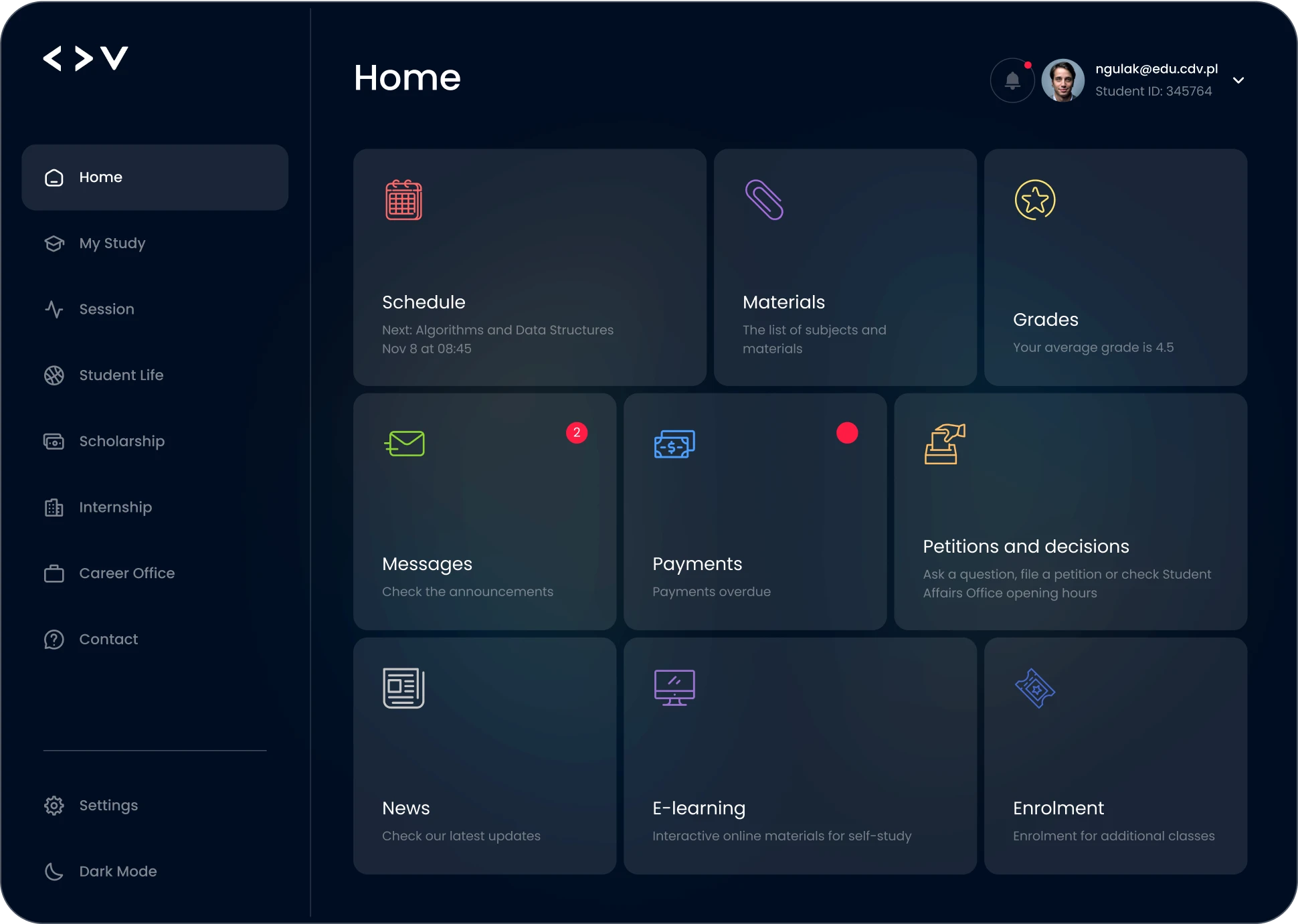
The portal features a versatile dark mode, providing a comfortable and visually pleasing experience for users in low-light settings. This mode reduces eye strain and conserves device battery, making it ideal for students who study late into the night or prefer softer lighting.
