Investments have never been easier
Nowadays, investments are gradually becoming an important part of our lives. However, investing requires training, as well as tools for them. Investure is an intuitive platform that does not require deep learning, the interface is clear even for beginners. With this platform, you can easily become a shareholder of top-growing companies and increase your capital.
Client
Investure
Industry
Fintech
Year
2024
Deliverables
Web App Design
Toolstack
Figma
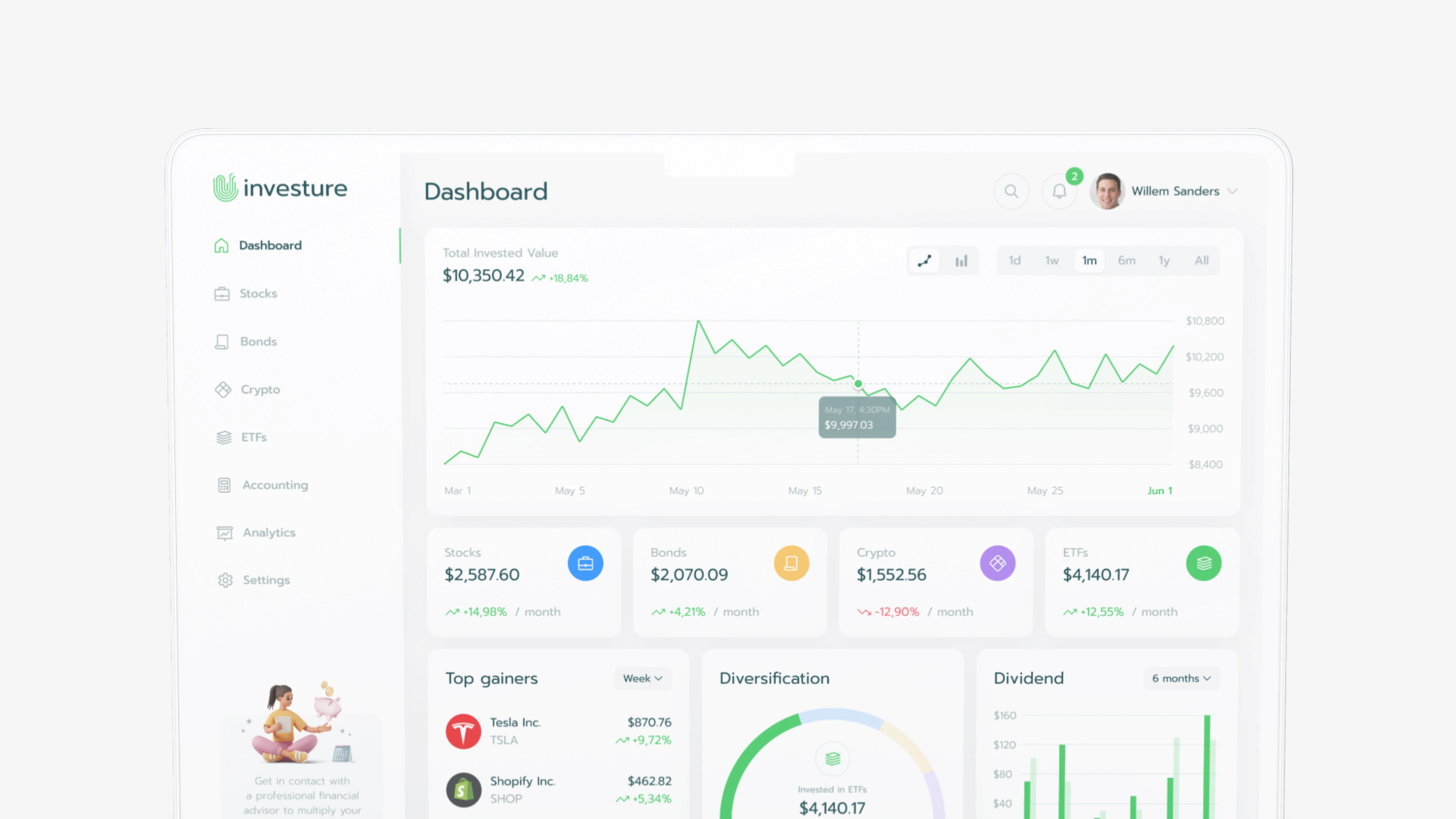


Invest confidently and effortlessly with Investure, the intuitive platform that makes investing accessible to everyone!
Invest confidently and effortlessly with Investure, the intuitive platform that makes investing accessible to everyone!
Invest confidently and effortlessly with Investure, the intuitive platform that makes investing accessible to everyone!
Goal
The goal is to create a user-friendly investment platform that simplifies the process of buying and managing stocks, ETFs, bonds, and cryptocurrencies, making it accessible to users of all experience levels. By offering an intuitive interface, personalized recommendations, and educational insights, the platform empowers users to confidently build their wealth without needing deep financial expertise. Investure aims to democratize investing, providing a seamless, secure, and trustworthy experience that encourages smart, data-driven decisions and fosters long-term financial growth.

User Research
I conducted interviews and surveys with potential users to understand their investment challenges. I found that many novice investors felt overwhelmed by complex jargon and excessive information. Users expressed a need for a guided onboarding process and personalized recommendations to simplify decision-making. This feedback helped identify key user pains and shaped the design solutions to create a more accessible investment experience.

Maria, 42
Small Business Owner
Maria is focused on secure, long-term investments and seeks a trustworthy platform with simple, low-risk options.

David, 35
Software Engineer
David wants a streamlined platform that provides personalized investment recommendations to grow his portfolio efficiently.

Sarah, 28
Marketing Manager
Sarah is new to investing and needs a simple platform that helps her start building wealth without feeling overwhelmed.

Maria, 42
Small Business Owner
Maria is focused on secure, long-term investments and seeks a trustworthy platform with simple, low-risk options.

David, 35
Software Engineer
David wants a streamlined platform that provides personalized investment recommendations to grow his portfolio efficiently.

Sarah, 28
Marketing Manager
Sarah is new to investing and needs a simple platform that helps her start building wealth without feeling overwhelmed.

Maria, 42
Small Business Owner
Maria is focused on secure, long-term investments and seeks a trustworthy platform with simple, low-risk options.

David, 35
Software Engineer
David wants a streamlined platform that provides personalized investment recommendations to grow his portfolio efficiently.

Sarah, 28
Marketing Manager
Sarah is new to investing and needs a simple platform that helps her start building wealth without feeling overwhelmed.
Problems
User interviews were conducted with target audience to get in-depth feedback and know better the users’ needs, pain points, and preferences.
01
Complexity for novice users
Simplifying the platform for beginners is crucial. Many potential investors are intimidated by financial jargon and complex processes. An intuitive UI that guides users step-by-step, explains key terms, and breaks down the investment process can make investing accessible to everyone, regardless of experience level.
02
Decision paralysis
Users often feel unsure about where to invest due to the overwhelming number of options and lack of guidance. Addressing this with features like personalized recommendations, curated portfolios, and goal-based investment suggestions can help users make confident, informed decisions quickly.
03
Overwhelming amount of information
Investment platforms can flood users with data, making it difficult to focus on what matters. A well-designed UX that prioritizes relevant information, uses visualizations effectively, and provides clear, digestible insights will enhance the user experience and make decision-making easier.
Solutions
01
Guided onboarding
I addressed the complexity for beginners by designing a guided onboarding process that walks users through the platform step by step. By using jargon-free language and intuitive navigation, I ensured that even novice users feel confident navigating the app. I also added tooltips to provide explanations whenever users need extra guidance, making the experience smooth and accessible for all.
02
Personalized recommendations
To tackle decision paralysis, I introduced personalized recommendations and goal-based investing options. These features allow users to select pre-built portfolios or follow investment paths based on their financial goals, simplifying their decision-making process. This approach makes it easier for users to invest confidently without feeling overwhelmed by too many choices.
03
Prioritized Information
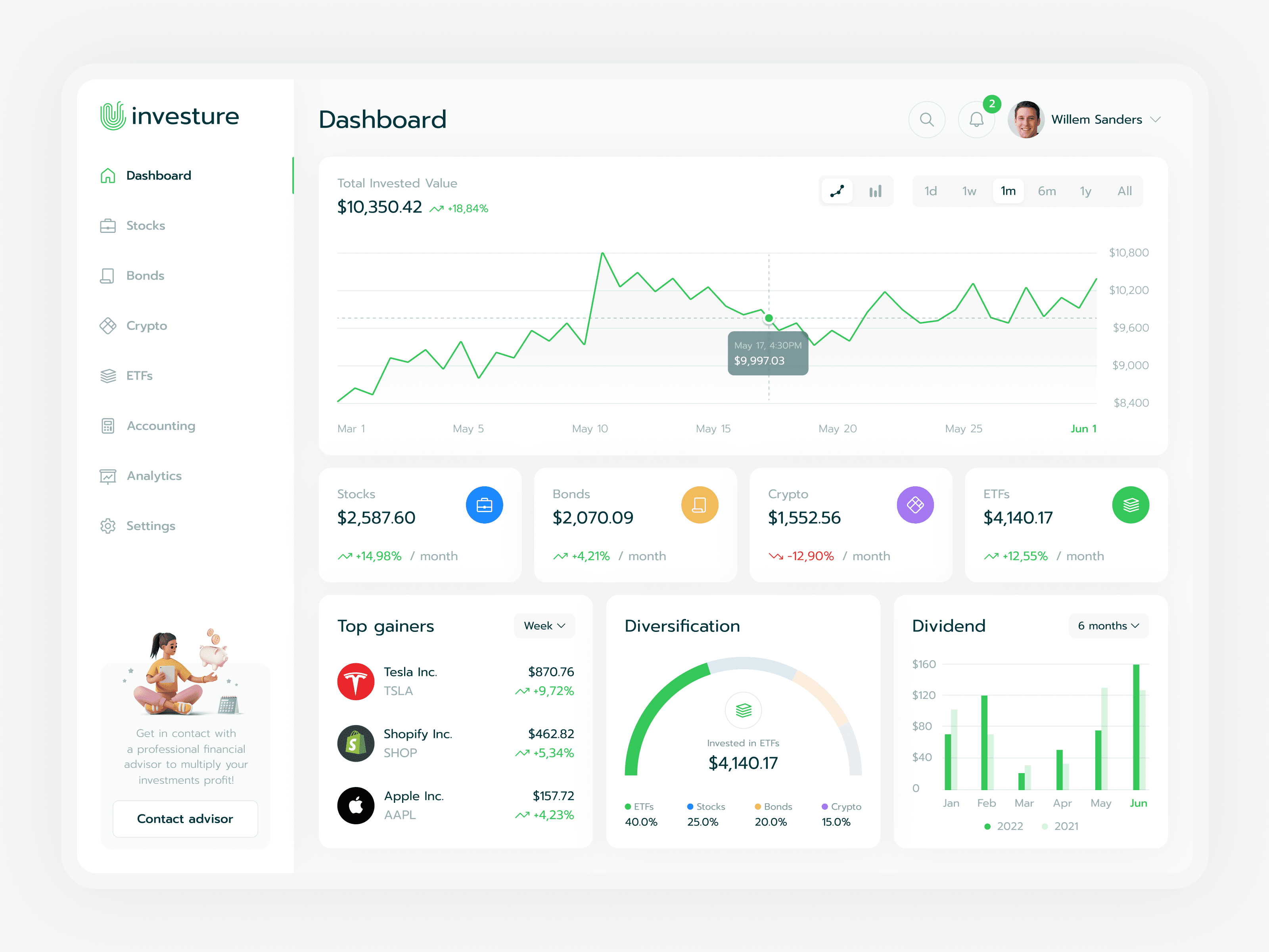
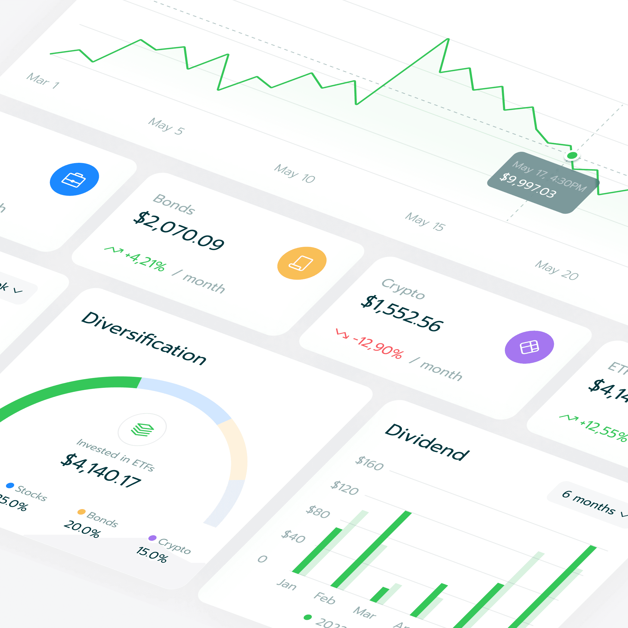
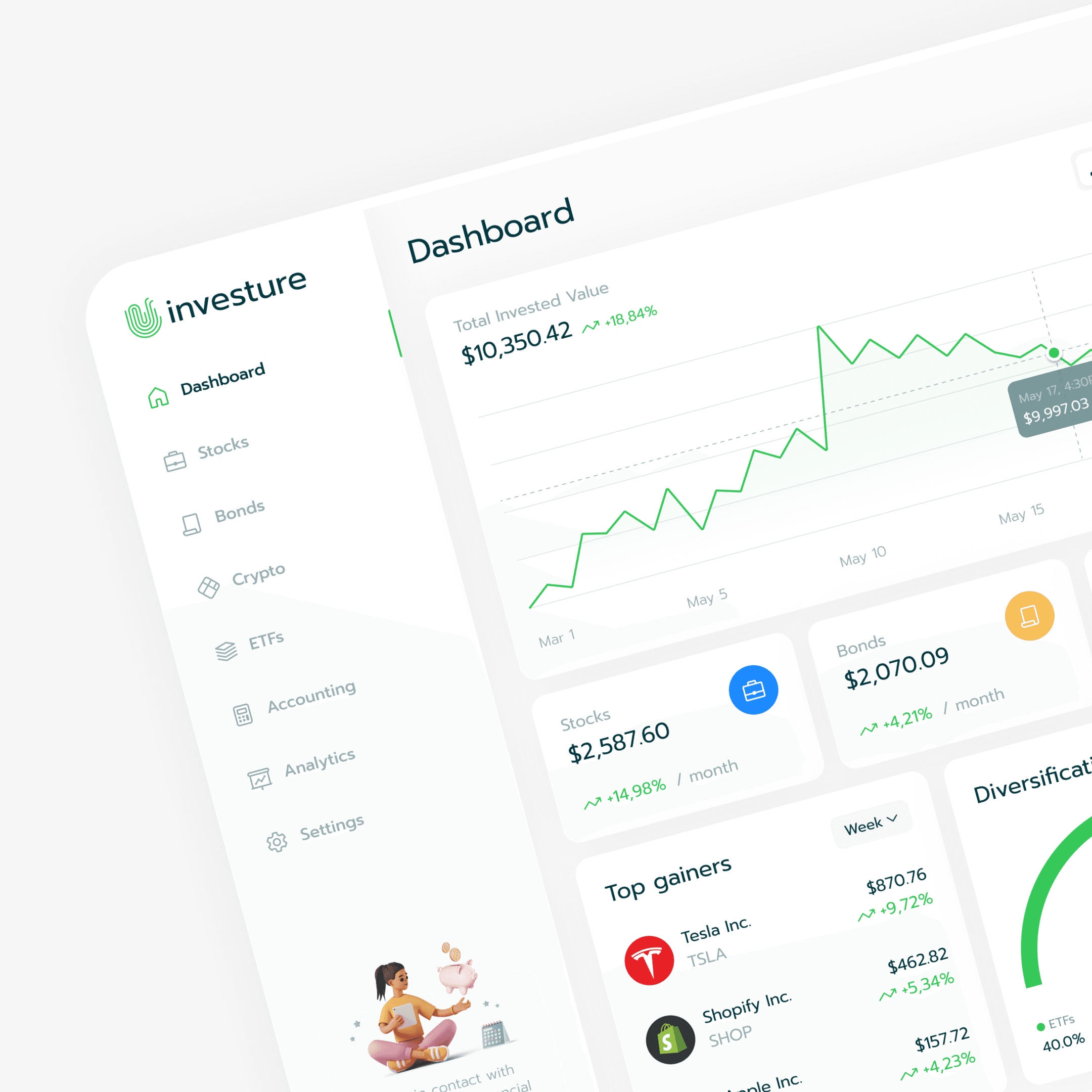
To resolve the issue of overwhelming information, I designed a clean interface that prioritizes key data like portfolio performance. By incorporating simple charts and customizable dashboards, I made it easy for users to focus on the most relevant information. This design ensures users can digest data at a glance and customize their experience to suit their needs.
Design Result
I designed a clean, modern interface that balances simplicity and functionality, catering to both novice and experienced investors. The intuitive navigation and minimalist layout prevent information overload, while key data points are clearly displayed through simple charts and graphs. Personalized features, such as customizable dashboards and tailored investment recommendations, enhance user engagement and create a unique experience for each investor.


Takeaways & learnings
Prioritizing the needs and experiences of users, especially novices, is crucial for creating an accessible platform that encourages investment.
Simplifying complex financial information through clear visuals and straightforward language helps users make informed decisions without feeling overwhelmed.
Incorporating personalized recommendations and customizable features significantly improves user engagement, making the experience more relevant and enjoyable.


Thank you for viewing!


Thank you for viewing!


Thank you for viewing!
See more of my work
I'm proud of the work I've done in my career, and I'm excited to share it with you.
Check out my other projects to see examples of my skills and experience.
See more of my work
I'm proud of the work I've done in my career, and I'm excited to share it with you.
Check out my other projects to see examples of my skills and experience.
See more of my work
I'm proud of the work I've done in my career, and I'm excited to share it with you.
Check out my other projects to see examples of my skills and experience.

